To make this illustrated scene, I followed Abbey Lossing's Skillshare tutorial. I think the tutorial is a good project-based way to learn After Effects, but I would say maybe it would be better as a second or third project, rather than your first time opening the program.
I watched the entire tutorial before attempting to design my own animation, so I would understand better any limitations there might be. I think I did this somewhat successfully, except for the background. In the tutorial, Abbey showed how to create a sense of depth with different speeds of movement in the main background, and a small cut out showing a background meant to be further in the distance. I loved this part, so as I was drawing I used it a lot, creating three separate areas where the mid-ground fell way to a distant skyline. Little did I realize I was complicating things for myself a bit. Luckily, my husband has a much more mathematical brain than me, and we were able to combine our brainpower to make it work. Below is a little step by step of how my illustration came together.

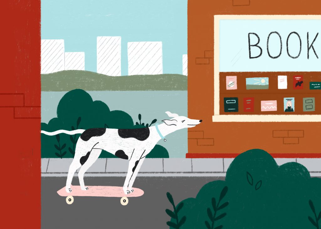
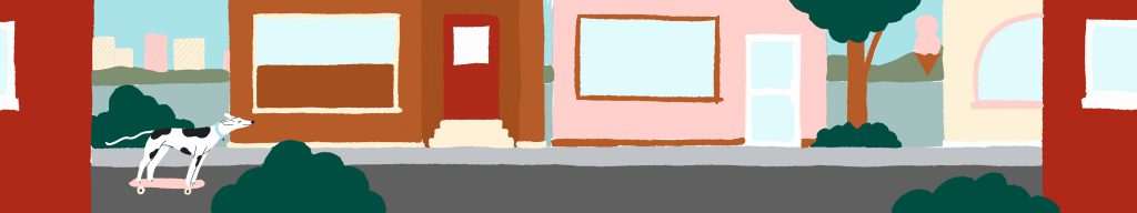
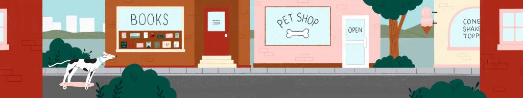
I knew from the start I wanted to do a greyhound on a skateboard, but I got stuck for weeks on the scenery around him. It's funny how you build up an idea in your head and make it a way bigger deal than it needs to be. I sketched a sort of country scene, and version with a cat in a window, a lil dog house for him to cruise past. I wanted to differentiate it from Abbey's example, but something about the more pastoral scenes I was sketching felt wrong. When you're skateboarding, you're really gonna be in the city. So after doing nothing with these sketches for about a month I went back to my first rough drawing of a city street, and as I added details it started to feel a lot more right. If I had just seen it through from the start instead of abandoning it and letting it sit, I probably would have saved a lot of time. Such is the creative process I guess.
Next I created a colour comp to see what palette worked best and would provide contrast to the character as he skated through. I think I pushed that rule a bit on the cream colour I included, but by the time I felt it truly was too low contrast, I had already merged the mid-ground layer and felt no desire to go redraw those parts. But you should learn from my mistake, that's the point of the colour comp. You also shouldn't merge things really....no matter how safe you feel there is always something you'll want to go back and adjust.
The third step was finalizing the background, keeping in mind that it needed to be split into a background, midground, and foreground in my case, to accommodate the different speeds things would need to move at, and how the character would interact with them.
Once everything was finalized I followed the rest of Abbey's tutorial to animate my character in Photoshop (something I was familiar with) and then import it with my separate background layers into AfterEffects. At this point I realized my problem with the furthest layer of my background, and enlisted my husband to help me sort it out. We ended up splitting each "window" where you could see the distance into its own layer and animating it separately. I definitely learned a bit about how I might plan something like this in the future.
Here's the full animation, I totally recommend the class on skillshare as it gives you something really tangible and exciting to create. You can find promo codes for a 2-month free membership all over the internet, but here's one more 🙂
No comments.